Your homepage gets about five seconds to prove its worth. Most visitors make a split-second decision about whether your site is relevant to them, and if the answer isn't immediately clear, they're gone. The difference between a homepage that converts and one that loses prospects often comes down to a simple shift in focus: making it about your customer, not about you. The best homepages pass what's known as the 5-second test by instantly answering what visitors care about most.
The 5-second test measures whether visitors can instantly understand what you do, if it's relevant to them, and what they should do next. A homepage that passes this test focuses on customer problems and outcomes rather than company credentials and features. It leads with clear value propositions, uses customer-focused language, and provides obvious next steps that move prospects toward a solution.
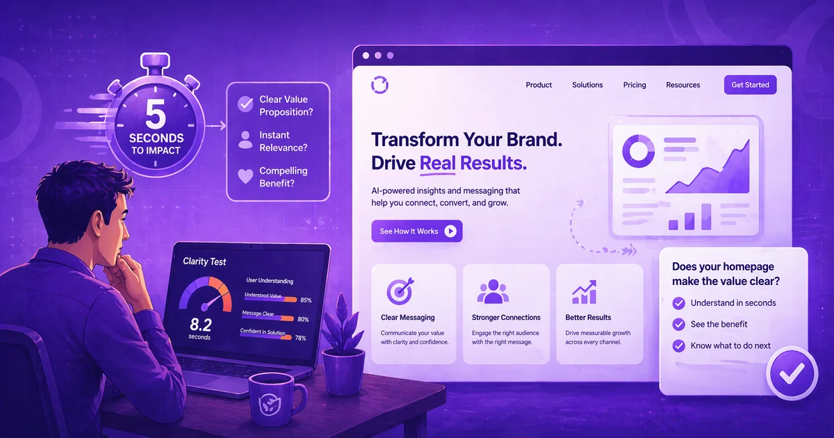
Why Five Seconds Matter More Than You Think
The science behind first impressions is startling. Users form first impressions of websites in just 50 milliseconds, according to research by Lindgaard and colleagues. That's faster than the blink of an eye. Within those crucial first moments, visitors are already deciding whether to stay or leave.
The stakes get higher when you consider browsing behavior. 55% of visitors spend less than 15 seconds on a website, which means you have an incredibly narrow window to communicate value. If your homepage doesn't immediately signal relevance, you're losing more than half your traffic before they even scroll.
This rapid-fire decision making happens because visitors are essentially asking three questions the moment they land on your page: What do you do? Is this for me? What should I do next? If any of these questions go unanswered in those first few seconds, the visitor moves on to a competitor who makes the value clearer.
The tragedy is that most homepages fail this test not because they lack value, but because they present that value in the wrong way. They talk about themselves instead of addressing customer needs.
The Fatal Flaw: Making Your Homepage About You
Walk through most business homepages and you'll see a predictable pattern. Headlines start with "We are" or "Our company." The copy focuses on credentials, history, and internal achievements. The messaging centers on what the business does rather than what the customer gets.
Take the example mentioned in FMG Suite's analysis of the Future of Humanity Institute. Their homepage mentioned supporting science and technology, but visitors couldn't quickly grasp what specific actions they took or how it benefited anyone. The messaging was about them, not about the outcomes they created for others.
This inside-out thinking creates several problems:
It forces visitors to translate benefits. When you say "We provide comprehensive financial planning services," visitors have to mentally convert that into "They might help me retire comfortably." Why make them work that hard?
It prioritizes your perspective over theirs. You care about your methodology and credentials. Visitors care about solving their problems. These aren't the same thing.
It creates cognitive load. Every second visitors spend trying to understand your jargon or figure out if you're relevant is a second closer to them leaving.
It sounds like everyone else. Company-focused messaging tends toward generic business speak that could apply to any competitor in your space.
The solution is flipping the script entirely. Instead of starting with what you do, start with what your customers get.
How to Flip Your Homepage From You to Them
The transformation begins with understanding that visitors don't care about your process until they believe in your promise. They want to know what their life looks like after working with you, not how you deliver that outcome.
Start With Their Problem, Not Your Solution
Before you mention what you do, acknowledge what they're experiencing. If you help restaurants improve profitability, don't lead with "We provide restaurant consulting services." Lead with something like "Tired of working 70-hour weeks while your restaurant barely breaks even?"
This approach works because it creates instant recognition. Visitors see their situation reflected back to them, which creates the emotional connection that keeps them reading.
The problem-first approach also differentiates you from competitors who jump straight to solutions. While they're talking about themselves, you're talking about the visitor's world.
Replace Features With Outcomes
Features are what you do. Outcomes are what customers achieve. The homepage that converts focuses relentlessly on outcomes because that's what people buy.
Instead of "Our CRM system includes automated email sequences," try "Never lose another lead because you forgot to follow up." Instead of "We offer comprehensive SEO services," try "Get found by customers who are ready to buy."
The outcome-focused version does three things the feature-focused version doesn't: it identifies a specific problem, promises a specific result, and speaks in language the customer uses internally.
Use "You" More Than "We"
Simple pronoun choice reveals whether your homepage is customer-focused or company-focused. Count the instances of "you" versus "we" in your current copy. If "we" wins, your homepage is probably failing the 5-second test.
Customer-focused homepages use "you" to put the visitor at the center of every sentence. "You'll see results within 30 days" hits differently than "We deliver results within 30 days." The first version makes the visitor the hero of the story. The second makes you the hero.
This isn't just about grammar. It's about perspective. When you consistently use "you," you're forced to think from the customer's viewpoint, which naturally leads to clearer, more compelling copy.
What a Customer-Focused Homepage Actually Looks Like
The best customer-focused homepages follow a predictable structure that answers visitor questions in order of importance. They lead with the customer's problem or desired outcome, explain what's possible, provide proof it works, and give clear next steps.
The Hero Section: Problem and Promise
Your hero section gets the most attention and carries the heaviest conversion load. Use it to immediately establish relevance by addressing the visitor's primary concern or goal.
A law firm might say: "Facing criminal charges? We've helped over 500 clients avoid jail time." A business coach might say: "Stuck at the same revenue level for two years? We help service businesses double their income in 12 months."
Both examples follow the same pattern: problem recognition, specific outcome, credibility indicator. The visitor immediately knows if this is for them and what they might achieve.
Social Proof: Show, Don't Just Tell
Customer-focused homepages use social proof strategically. Instead of generic testimonials that say you're "great to work with," they showcase specific customer outcomes that prove your promises.
"Sarah increased her email list by 300% in six months" works better than "Sarah loves working with our team." The first version reinforces your value proposition with concrete evidence. The second is just nice to hear.
Case studies, before-and-after comparisons, and specific metrics all serve the same purpose: they show visitors what's possible rather than just claiming you're capable.
Clear Next Steps: Remove Friction
The 5-second test also evaluates whether visitors understand what to do next. Customer-focused homepages make the next step obvious and low-risk.
Instead of "Contact us for more information," try "Get your custom growth plan." Instead of "Schedule a consultation," try "See if we're a good fit." The customer-focused versions feel like benefits rather than commitments.
Testing Your Homepage Against the 5-Second Rule
The most reliable way to know if your homepage passes the test is to actually run it. The process is simpler than most usability testing and gives you immediate feedback on clarity and relevance.
The Basic Test Process
Show your homepage to someone unfamiliar with your business for exactly five seconds, then ask them three questions: What does this company do? Is this relevant to you (or someone you know)? What would you do next if you were interested?
If they can't answer these questions clearly, your homepage is likely failing with real visitors too. The Center Centre guide suggests running this test with 10-15 people to get reliable patterns in the feedback.
What Good Responses Look Like
Strong test responses are specific and use the visitor's own words rather than your marketing language. If you help restaurants improve profitability and the test participant says "They help restaurants make more money," that's a win. If they say "They do restaurant consulting," that's less clear.
Good responses also indicate emotional connection. Comments like "This would be perfect for my friend who owns a restaurant" suggest the messaging resonated beyond just intellectual understanding.
Common Test Failures and Quick Fixes
Most homepage failures fall into predictable categories. Vague positioning like "We're a leading voice in our industry" leaves visitors confused about what you actually do. Jargon-heavy copy forces visitors to translate your meaning. Weak or missing calls-to-action leave people unsure about next steps.
The fixes are usually straightforward. Replace vague claims with specific outcomes. Swap industry jargon for customer language. Make your call-to-action about what they get rather than what they give you.
What the Data Says
Users form first impressions in 50 milliseconds according to Lindgaard et al. research from 2006. This means your homepage design and headline create an immediate impression before visitors even start reading.
55% of visitors spend less than 15 seconds on websites based on FMG Suite's analysis. This short attention span makes clarity and immediate relevance critical for keeping visitors engaged.
The 5-second test reveals whether pages effectively communicate purpose as documented by usability experts at Center Centre. Quick testing can identify clarity issues that longer usability studies might miss.
Clear value propositions outperform clever messaging according to conversion optimization research. Visitors prefer immediate understanding over creative wordplay when making quick relevance decisions.
Homepage Testing FAQs
Q: How many people should I test my homepage with to get reliable feedback?
Testing with 10-15 people typically reveals clear patterns in how visitors interpret your homepage. You'll start seeing repeated themes in their responses after just 5-6 tests, but testing with more people helps confirm those patterns and catch outliers.
Q: Should I test my homepage with my target audience or random people?
Start with people outside your target audience for the clearest feedback on basic clarity. If random people can understand what you do, your target audience definitely will. Once you pass that test, then test with ideal customers to fine-tune messaging and relevance.
Q: What's the difference between a 5-second test and regular user testing?
The 5-second test focuses purely on first impressions and immediate comprehension. Regular user testing examines the full experience of using your site. Both are valuable, but the 5-second test specifically measures whether your homepage communicates value quickly enough to keep visitors engaged.
Q: How often should I retest my homepage after making changes?
Test again whenever you make significant copy or design changes to your homepage. Even small headline tweaks can dramatically impact how quickly visitors understand your value. Plan to test quarterly if you're actively optimizing your homepage performance.
Q: What should I do if people understand what I do but don't see it as relevant to them?
This usually indicates a targeting or positioning issue rather than a clarity problem. You may need to narrow your messaging to speak to a more specific audience, or adjust your value proposition to address more pressing customer problems.
Key Takeaways
- Your homepage has roughly five seconds to prove relevance before visitors leave, making customer-focused messaging critical for engagement and conversion.
- Lead with customer problems and desired outcomes rather than your company credentials or process details to create immediate emotional connection and understanding.
- Test your homepage by showing it to unfamiliar people for five seconds and asking what you do, if it's relevant, and what they'd do next to identify clarity gaps.
- Replace company-focused language ("We provide") with customer-focused language ("You get") to keep visitors at the center of your messaging.
- Use specific outcomes and social proof rather than generic claims to demonstrate value and build credibility quickly.
How Your Brand Blueprint Can Help with This
Your Brand Blueprint's 360 View and Brand Messaging sections work together to solve exactly this homepage challenge. The 360 View creates a detailed profile of your ideal customer, including their specific pain points and decision-making process, while Brand Messaging develops the core framework that puts customer outcomes at the center of your communication. These sections ensure your homepage speaks directly to what your visitors care about most rather than what you want to say about yourself.
Ready to put this into practice? BrandBlueprint.ai builds your complete brand messaging strategy -- including the sections that cover exactly what we talked about here.